Table of Contents
1.Introduction
Color consistency is one of the biggest challenges designers face in custom fabric printing. You’ve created the perfect design on your screen, only to receive printed fabric that looks too dark, too dull, or completely different. This phenomenon—known as fabric color mismatch—can ruin a project and waste valuable time and resources.
In this guide, you’ll learn what causes these discrepancies, how to ensure color accuracy in fabric printing, and practical steps to achieve consistent results across every order.
👉 If you’re planning to bring your fabric ideas to life, start here: Design Your Fabric.
2.What Causes Fabric Color Mismatch?
Before fixing color issues, it’s crucial to understand why they happen. Several factors influence how colors appear on printed fabrics:
a. Printing Technology Differences
Different fabric printing methods—such as sublimation, reactive dye, or pigment printing—use unique ink systems and heat processes. These variations can cause color shifts, especially if the same design is printed across multiple methods.
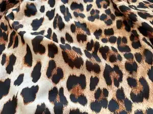
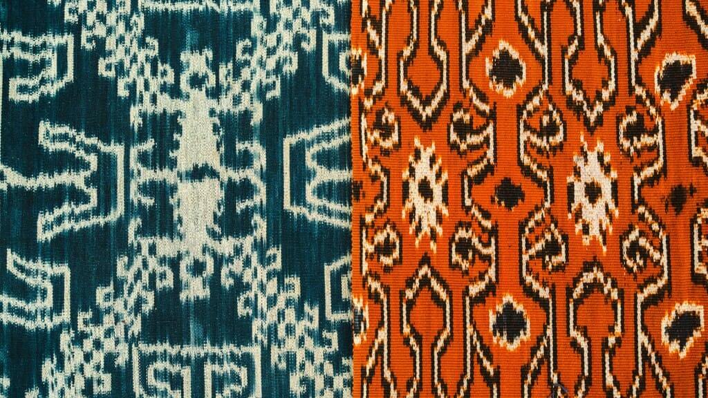
b. Fabric Type and Texture
Each fabric absorbs and reflects ink differently. Cotton tends to produce softer tones, while polyester often gives brighter and more saturated results. The weave, finish, and texture can also impact color appearance.
c. Lighting Conditions
The color of fabric under daylight (D65) will look different under warm indoor lighting (tungsten). Always evaluate printed samples under standardized lighting.
d. Monitor Calibration Issues
Most screens are not color-calibrated. What looks vibrant on your display might appear muted when printed. Using an uncalibrated monitor is one of the main causes of color inconsistency in fabric printing.
e. Ink Absorption & Coating
The amount of ink a fabric can absorb depends on its surface coating and pre-treatment. Inconsistent coating leads to uneven color reproduction.
3.The Science Behind Color Accuracy
Color accuracy is not just about matching what you see—it’s a science of managing how colors are defined, displayed, and printed.
Color Spaces (RGB, CMYK, LAB):
Designers usually work in RGB, but printers operate in CMYK. Some colors visible in RGB can’t be reproduced in CMYK. LAB color spaces are used for precise measurement of color differences (ΔE).
ICC Profiles:
Every printer-fabric-ink combination has its own ICC profile that helps translate on-screen colors to printed output. Using the correct ICC profile ensures color predictability.Color Management Workflow:
A consistent workflow—from digital design to final print—prevents fabric color mismatch. Use calibrated devices and maintain consistent profiles throughout.
4.Practical Steps to Prevent Color Mismatch
4.1 Calibrate Your Devices Regularly
Regular monitor calibration ensures that what you see on screen closely represents the printed output. Tools like the Datacolor Spyder or X-Rite ColorMunki can help maintain accuracy.
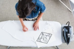
4.2 Use Color Swatches Before Production
Always print a small fabric swatch before full production to verify color results. This allows you to make adjustments before wasting fabric.
👉 You can order fabric swatches here to test colors and fabric types.
4.3 Choose the Right Fabric Type
The base fabric determines how ink interacts with the surface. For example, prints on silk will always look different from polyester due to texture and sheen.
Explore your options here: Our Fabrics.
4.4 Maintain a Controlled Printing Environment
Temperature, humidity, and machine maintenance directly affect color consistency. Keep your workspace within optimal environmental conditions recommended by the printer manufacturer.
4.5 Communicate with Your Printing Partner
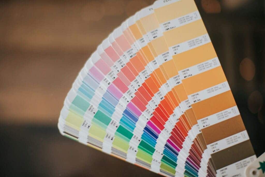
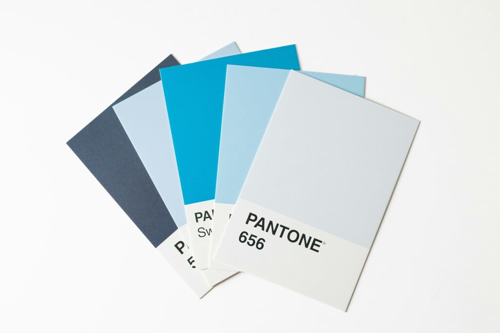
Provide Pantone references, color charts, and notes on expected results. Good communication ensures both designer and printer share the same visual target.
💡 Pro tip: Always ask your printer to confirm their ICC profile and color workflow for transparency and repeatability.
5.Recommended Tools and Techniques for Designers
For digital designers, achieving color accuracy in fabric printing starts in the software:
Adobe Photoshop / Illustrator:
Use CMYK color mode when preparing print files.
Embed ICC profiles before exporting.
Pantone Color Bridge:
Helps you visualize how spot colors will look when converted to CMYK.Color Calibration Tools:
Datacolor SpyderX or X-Rite is essential for designers aiming for professional-level accuracy.
🌈 External Resource: Pantone Color Systems and Adobe Color are excellent for exploring color harmonies and matching palettes.
6.Case Study: From Design to Perfect Match
A fashion designer created a tropical pattern using vibrant greens and oranges. The first fabric print appeared dull and washed out. By switching to a fabric with better coating, calibrating the monitor, and using the correct ICC profile, the final print matched 98% of the original design (ΔE<2).
This example highlights that color mismatch is not about luck—it’s about process. Consistent calibration, test prints, and material selection lead to reliable results.

7.Common Myths About Fabric Color Mismatch
Myth 1: “The same color looks identical on all fabrics.” ❌
→ Different fibers reflect light differently.Myth 2: “Screen colors equal print colors.” ❌
→ RGB and CMYK differ drastically in color gamut.Myth 3: “Once calibrated, you’ll never have color issues.” ❌
→ Environmental factors and ink batches can still affect accuracy.
Understanding these misconceptions helps designers approach color management scientifically rather than intuitively.
8.How JCW Textile Ensures Color Accuracy
At JCW Textile, we follow strict color management workflows for every order:
ICC-profiled printers for each fabric type
Controlled humidity and temperature during printing
Pre-print color tests and quality checks
Expert support for designers seeking consistent results
🎨 Ready to turn your digital design into fabric with perfect color accuracy?
👉 Get a Quote or Design Your Fabric.
9.Conclusion
Color accuracy in fabric printing is a blend of art, science, and communication. Understanding the causes of fabric color mismatch and applying these preventive steps allows designers to bring their visions to life without unwanted surprises.
Whether you’re designing apparel, home décor, or art prints, precision and consistency are within your reach—with the right tools, knowledge, and printing partner.
📚 Frequently Asked Questions (FAQs)
Q1: Why does fabric color mismatch happen after printing?
Fabric color mismatch occurs because of differences between digital screen colors (RGB) and printer inks (CMYK). Fabric type, ink absorption, and coating quality also play a major role in color variation.
Q2: How can I achieve better color accuracy in fabric printing?
To improve color accuracy in fabric printing, calibrate your monitor regularly, use ICC color profiles, and always print a fabric swatch before mass production. This ensures consistent results across every batch.
Q3: Which fabrics offer the best color consistency for printing?
Polyester fabrics with special coatings deliver the highest color consistency in textile printing. Natural fibers like cotton and linen may show slight color variations due to absorbency and surface texture.
Q4: How can I prevent unwanted color shift in fabric printing?
Keep a controlled environment—stable temperature and humidity—and maintain well-calibrated printers. These steps help minimize color shift in fabric printing and maintain uniform results.